The Corn Stores
Details
Art direction
Branding
Email marketing
Identity
Print design
The Corn Stores is a Grade II listed pub and restaurant, located in Reading town centre. The site offers multi-levels for bars, dining and a private members lounge on the top floor.
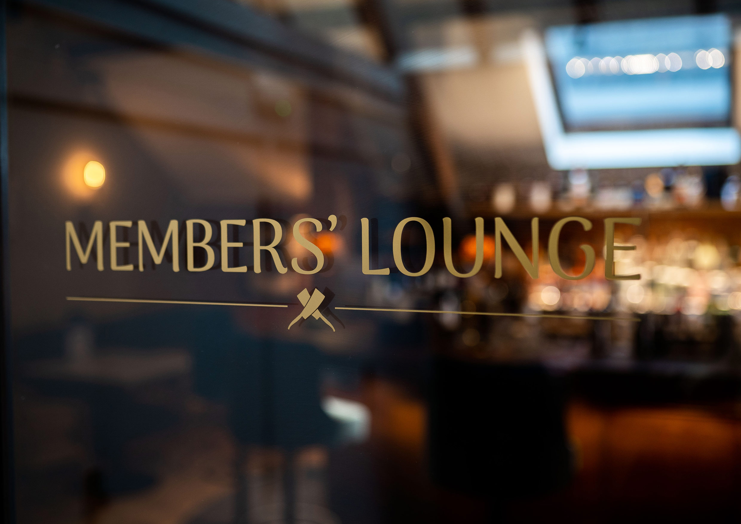
I was asked to create the logo for The Corn Stores, along with creating a style for the exterior signage, and a simple brand identity to be used on all forms of marketing and communications – from menus to email newsletters – which complemented the interior design style of the fabrics and construction materials specified by the architects.
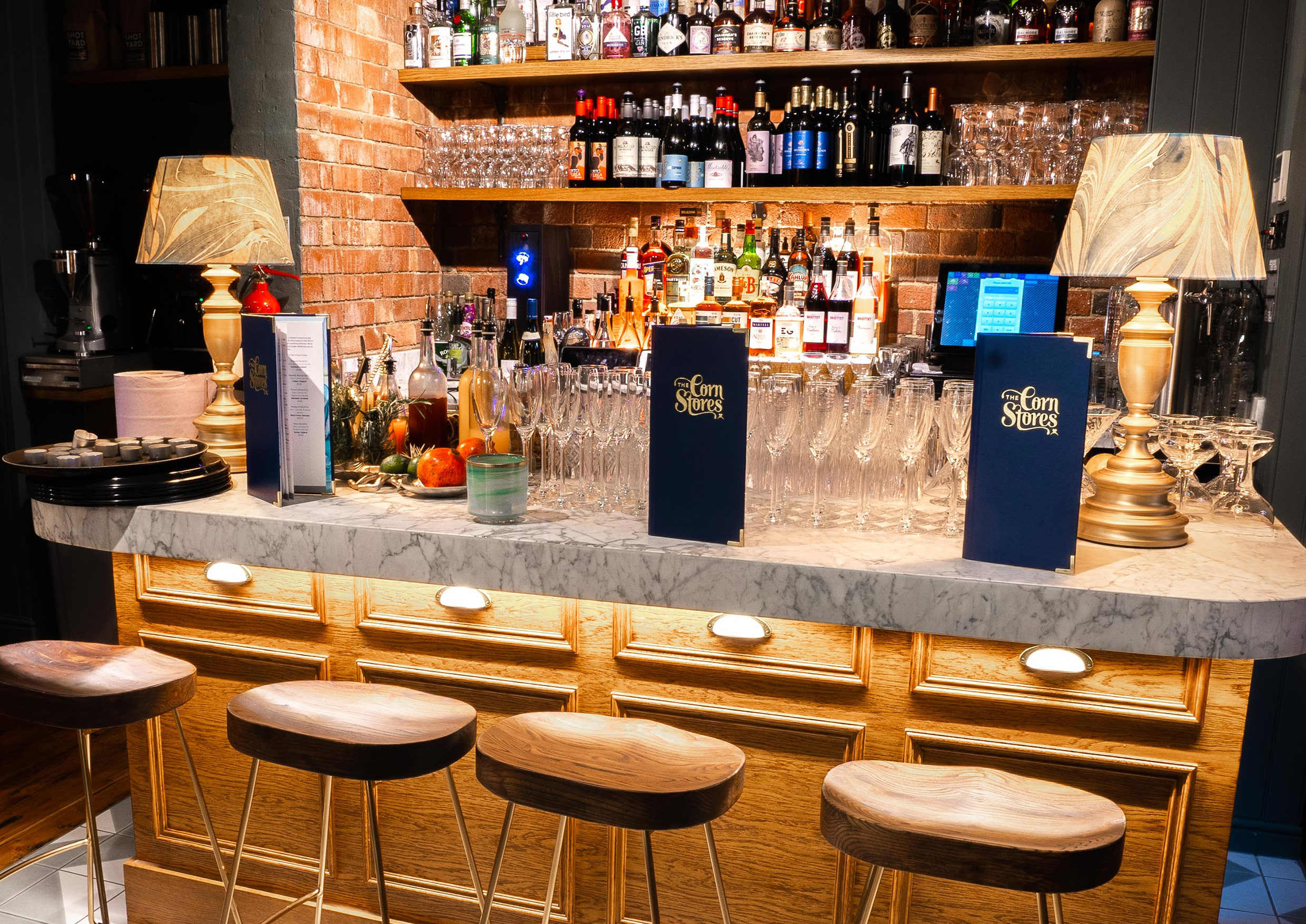
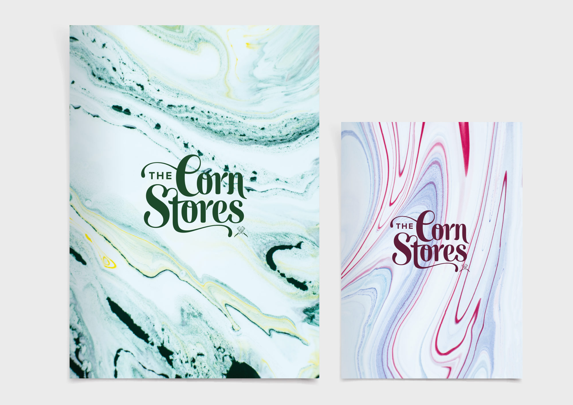
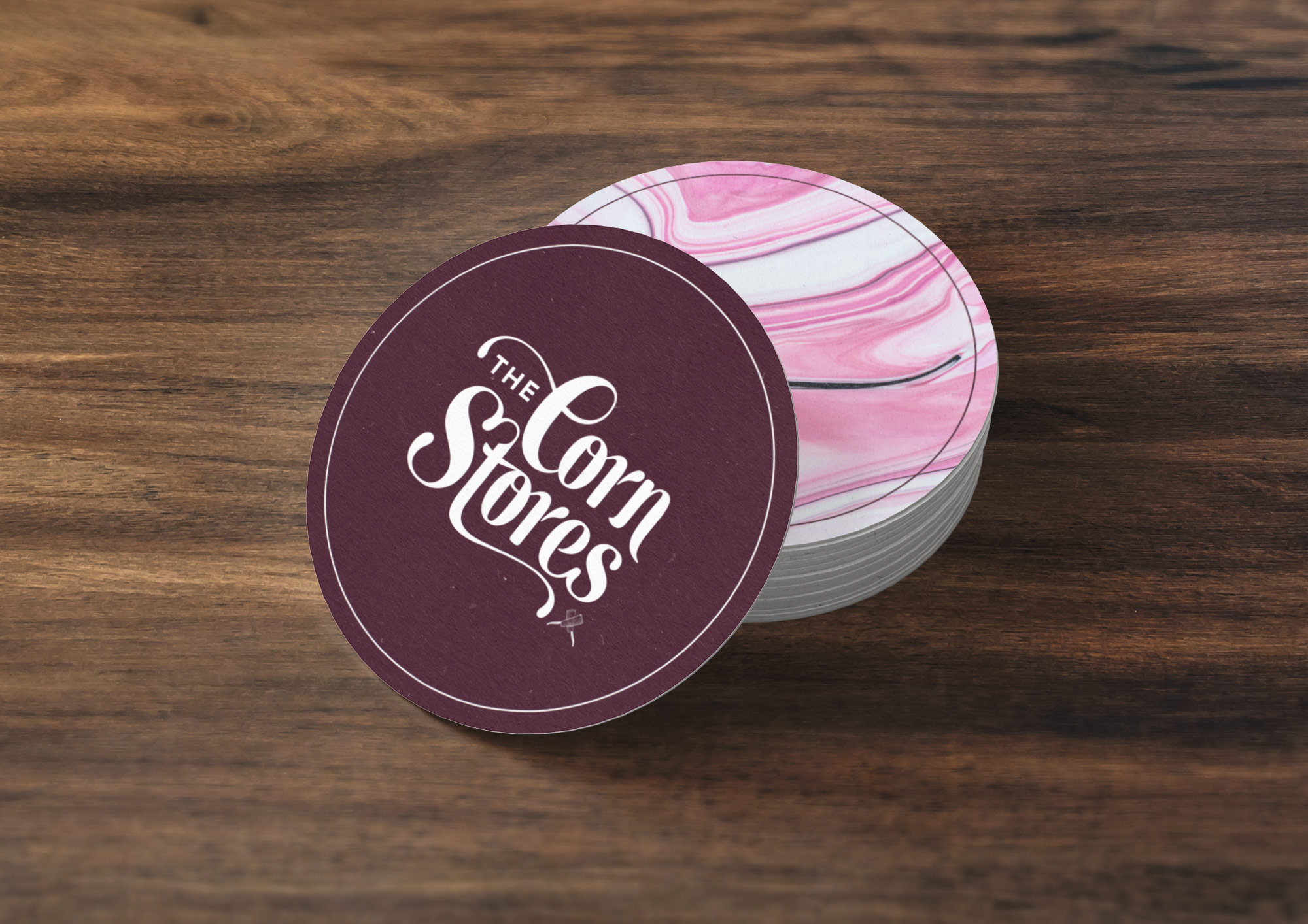
A bespoke logotype was created, that was modern, yet had a hint of Victorian elegence. The logotype also contained subtle cues to corn in the serifs and descenders. This was positioned with a colour palette containing rich greens, burgundy and gold. The logo was applied to the external signage of the pub, as well as on printed pieces such as menus, coasters and business cards.
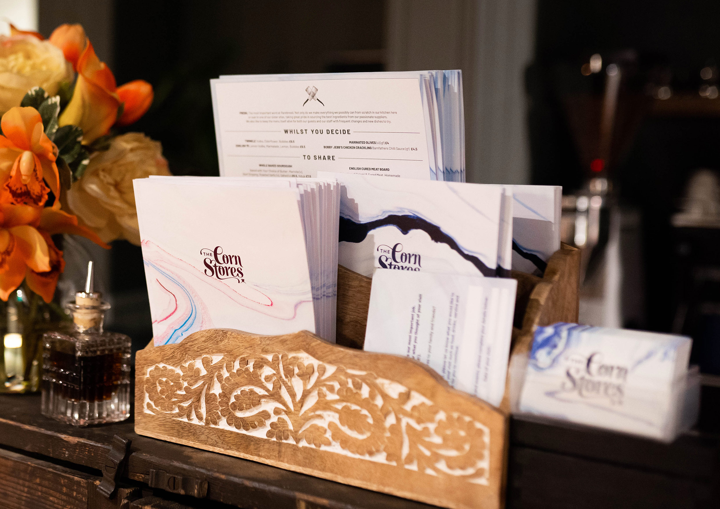
A set of unique marble patterns was used on pre-printed menus and email marketing, which complimented the floral print of fabrics and decoration within the pub.


“The work Dan did on The Corn Stores really brought it to life and gave it the impact it needed as one of the leading food and drink destinations in Reading city centre. We loved it all – the colours and typeface really aligned to the decor, and the logo finished it off perfectly.”
Sarahjayne Matthew, Marketing Manager, Rarebreed Dining.


Projects

IMO Car WashBrand visual identity
Blank White SpaceWebsite and e-commerce

Performance from ChickenshedBrand and print design
The Stress Combat ToolkitBrand and print design

The Customer Service PlaybookPrint design

RareBrand Identity
Amar La CasaWebsite
Panaché du SudBrand and packaging